Africa Youth portal
The Portal's research focuses on key thematic areas including youth inclusion, gender, education, climate change, and peace/security. Complementing its digital platform, the initiative features a Research Programme—a robust capacity-building effort. This program annually trains 20 young scholars in policy writing, research strategy, digital innovation, and professional development, preparing a new generation of African experts for global leadership.

The Africa Youth Portal, a strategic capacity-building initiative by SAIIA and the Mastercard Foundation, revitalizes the original Africa Portal into a dynamic hub for youth-led research. Developed in collaboration with Souled Studios, the project bridges rigorous policy work with contemporary digital engagement.
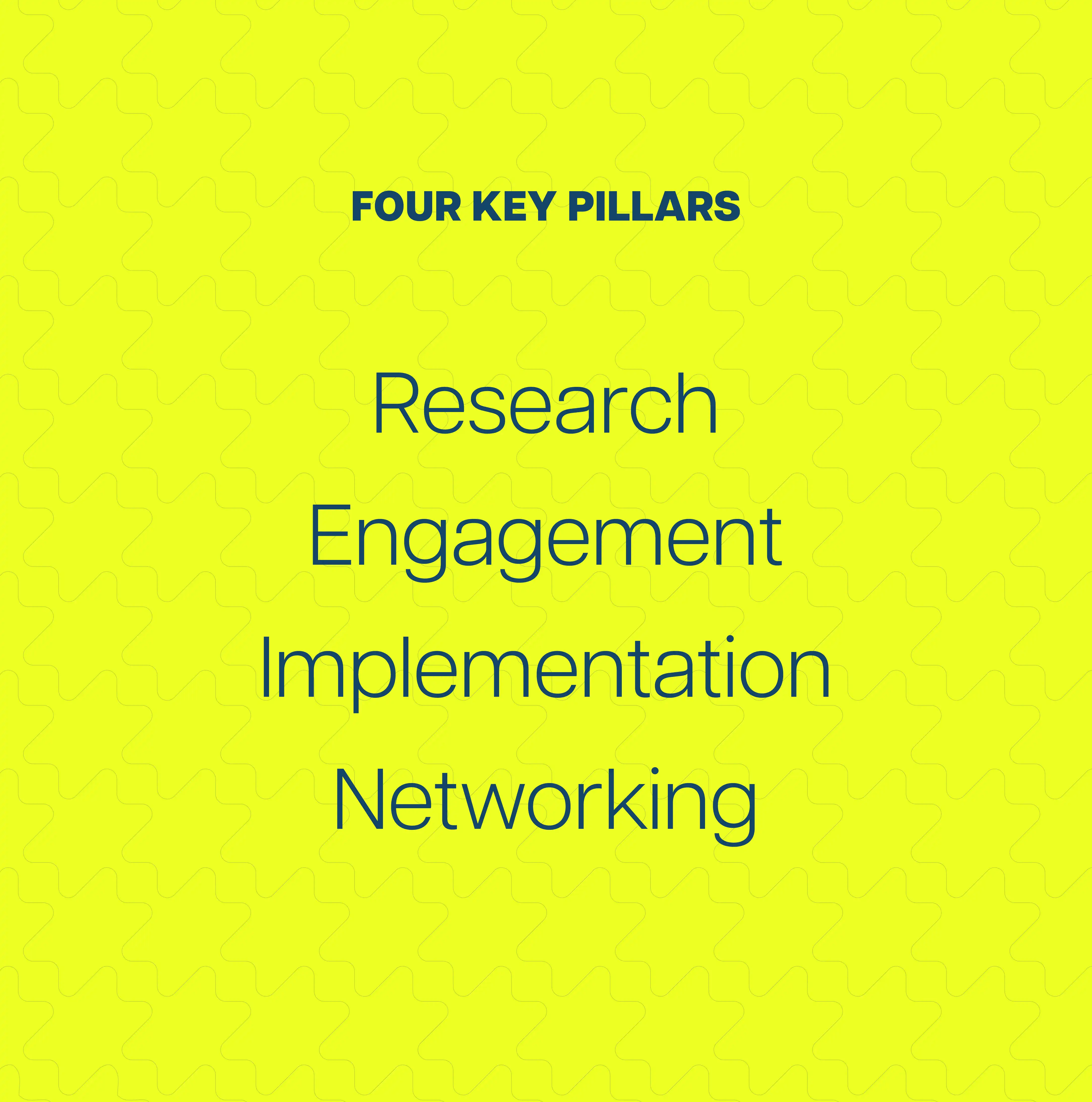
The objective was to establish a comprehensive brand identity that empowers young researchers to amplify their voices and influence continental decision-making. By transforming a traditional institutional resource into a modern, scalable digital product, the portal now serves as a premier destination for knowledge and leadership development, maintaining institutional excellence while resonating with Africa's emerging generation of thinkers, focusing on Research, Engagement, Implementation, and Networking.
We delivered a complete branding system that positions the portal as a credible, youth-powered knowledge platform. The solution centers on a "Confident, Modern, Intelligent, and Pan-African" personality, ensuring the identity feels empowering and future-focused.

The strategy for the Africa Youth Portal is rooted in revitalizing youth-led research and capacity building. As a strategic division of SAIIA, the brand strikes a balance: it is as structured as a global think-tank yet as engaging as a contemporary media platform. We identified the core personality as Confident, Intelligent, and Future-focused, ensuring the portal acts as a credible hub for the participants.
By avoiding bureaucratic aesthetics, the strategy focuses on empowering young leaders to transition from passive observers to active shapers of policy, celebrating the vibrant, Pan-African spirit of Africa’s next generation.

The verbal identity projects a voice that is both sophisticated and empowering, moving away from rigid, academic-heavy tones. It embraces a narrative that is clear, inclusive, and modern, reflecting the objective to equip young Africans with research tools. The tone is consistently intelligent and future-facing, acting as a catalyst for narrative change.
By maintaining this balance, the portal ensures its outputs are viewed as credible resources by institutional partners while remaining inspiring to the emerging leaders driving Africa’s development.

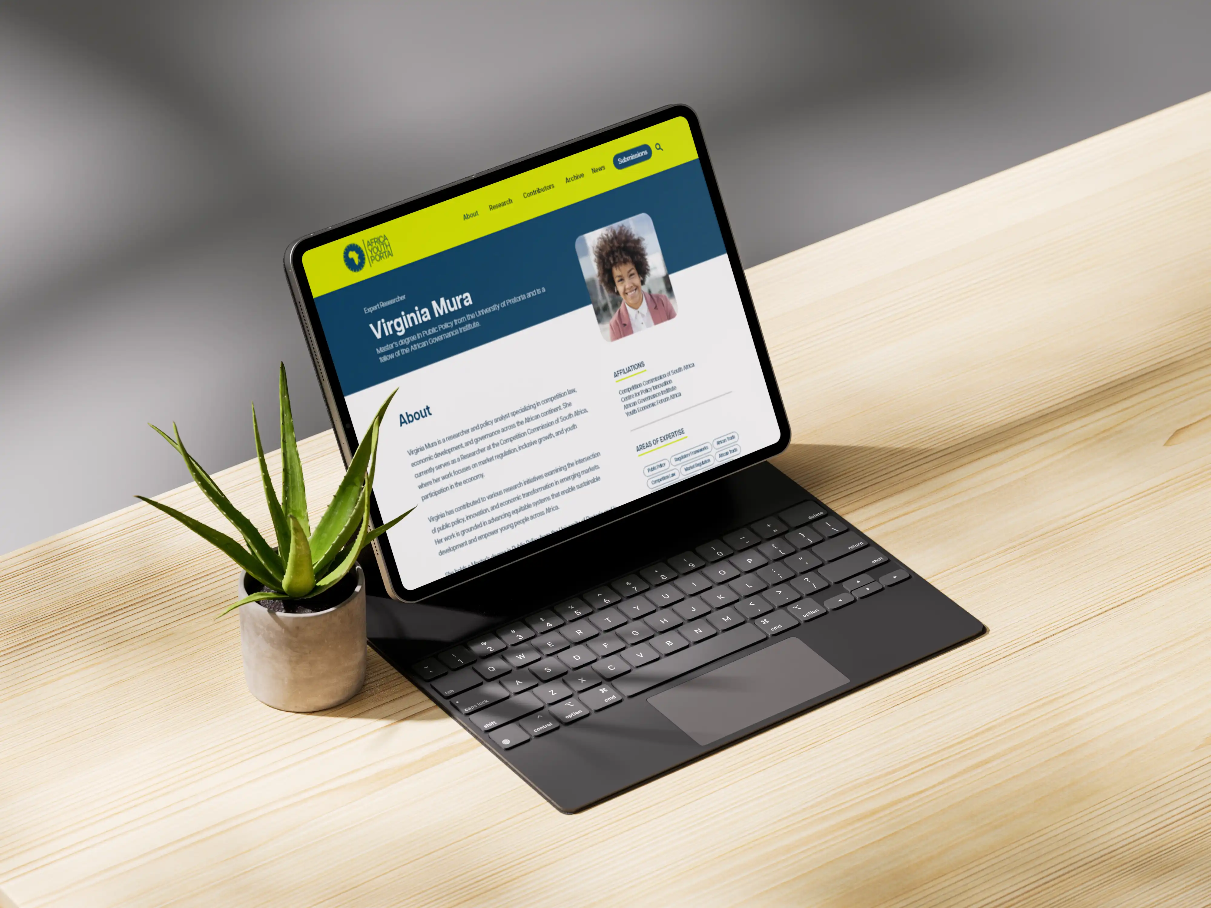
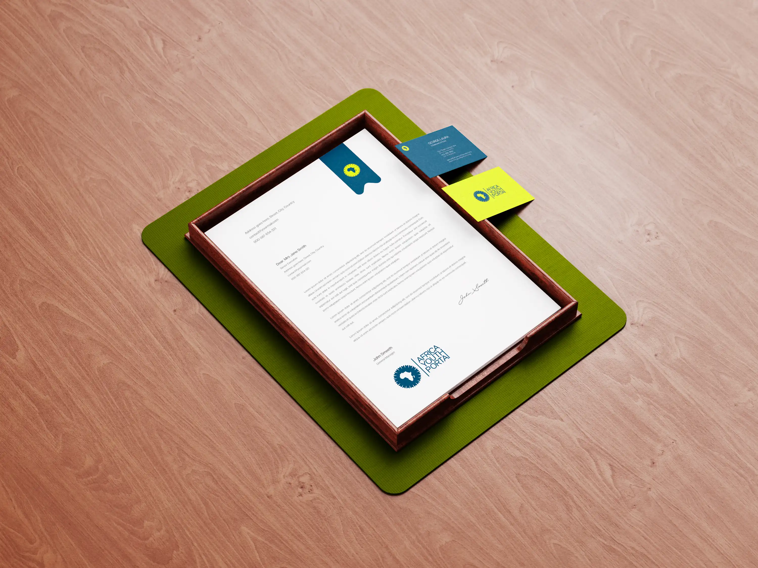
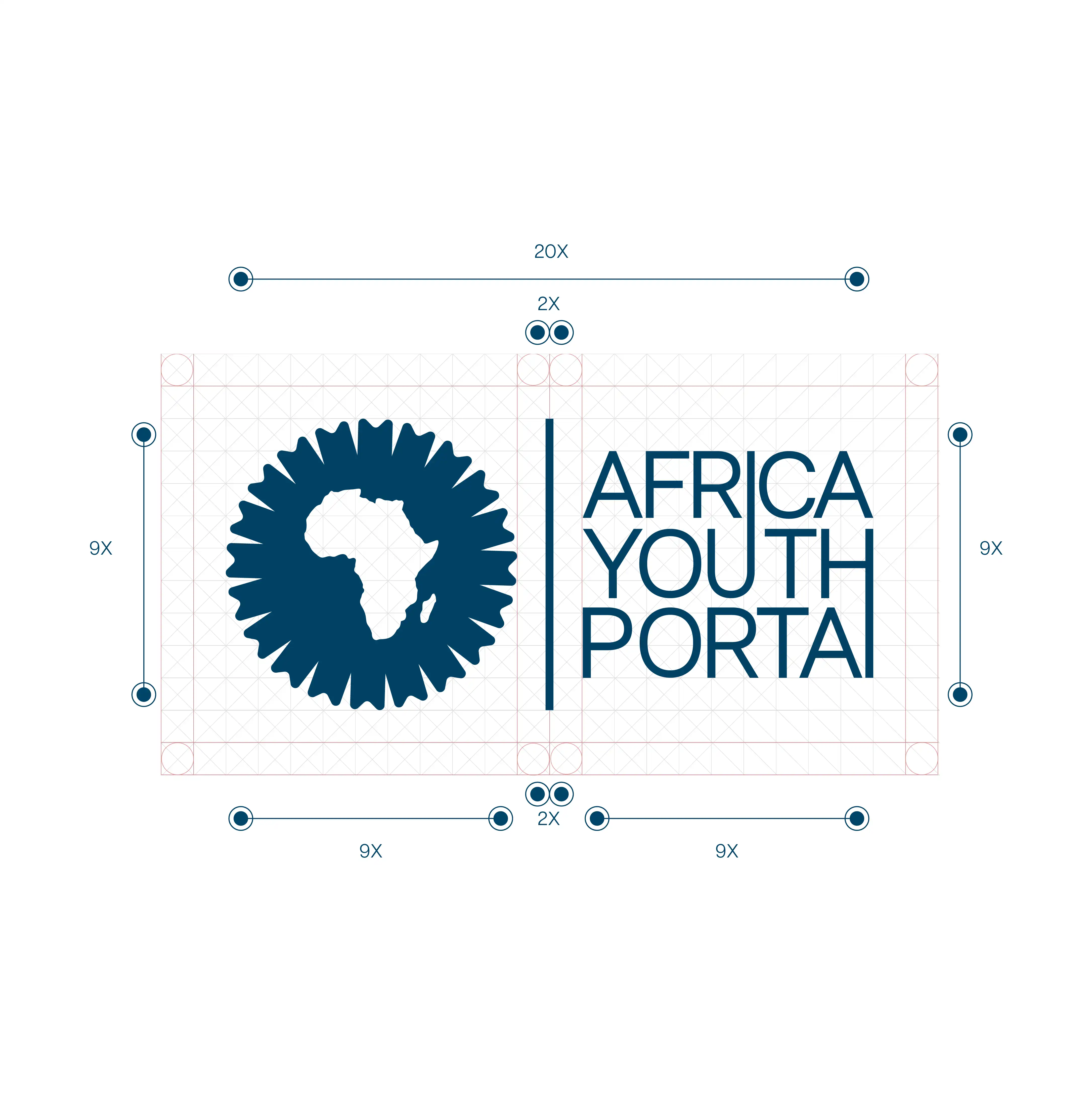
The logo concept is centered on the " Bookmark," a powerful symbol representing the gateway to knowledge, research, and continental access with 20 instances representing 20 participants. This mark combines the silhouette of the African continent with the functional form of a bookmark, signaling the portal's role as Africa’s premier knowledge hub. It is designed to empower the next generation of leaders, with the structure reinforcing the platform as a trusted resource for emerging thinkers.
By blending contemporary design with institutional weight, the logo elevates young African voices while maintaining the credibility required of a SAIIA division. It serves as a visual anchor for leadership and unity, ensuring the brand remains recognizable across all digital touchpoints, from mobile app icons to high-level research publications.
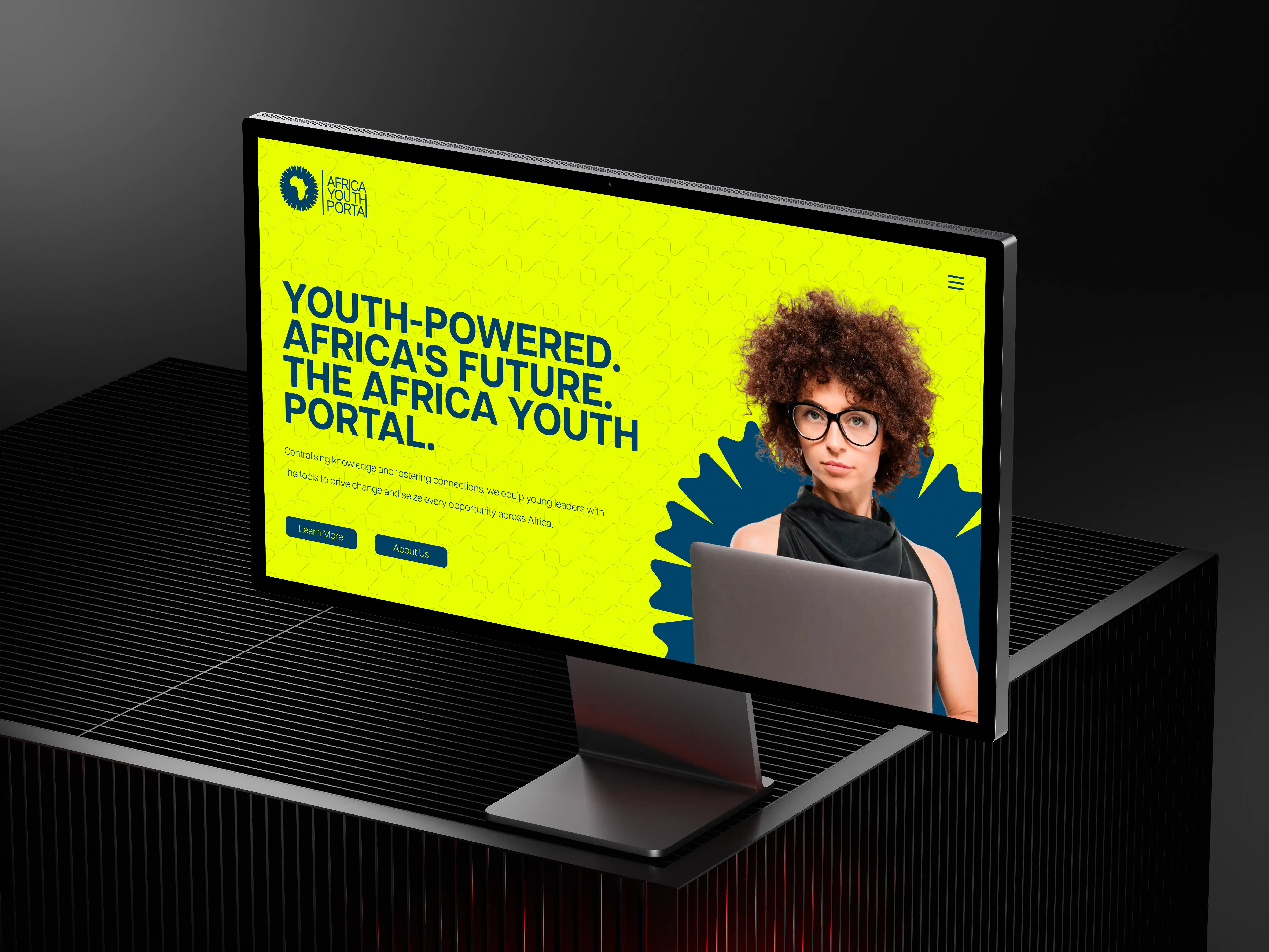
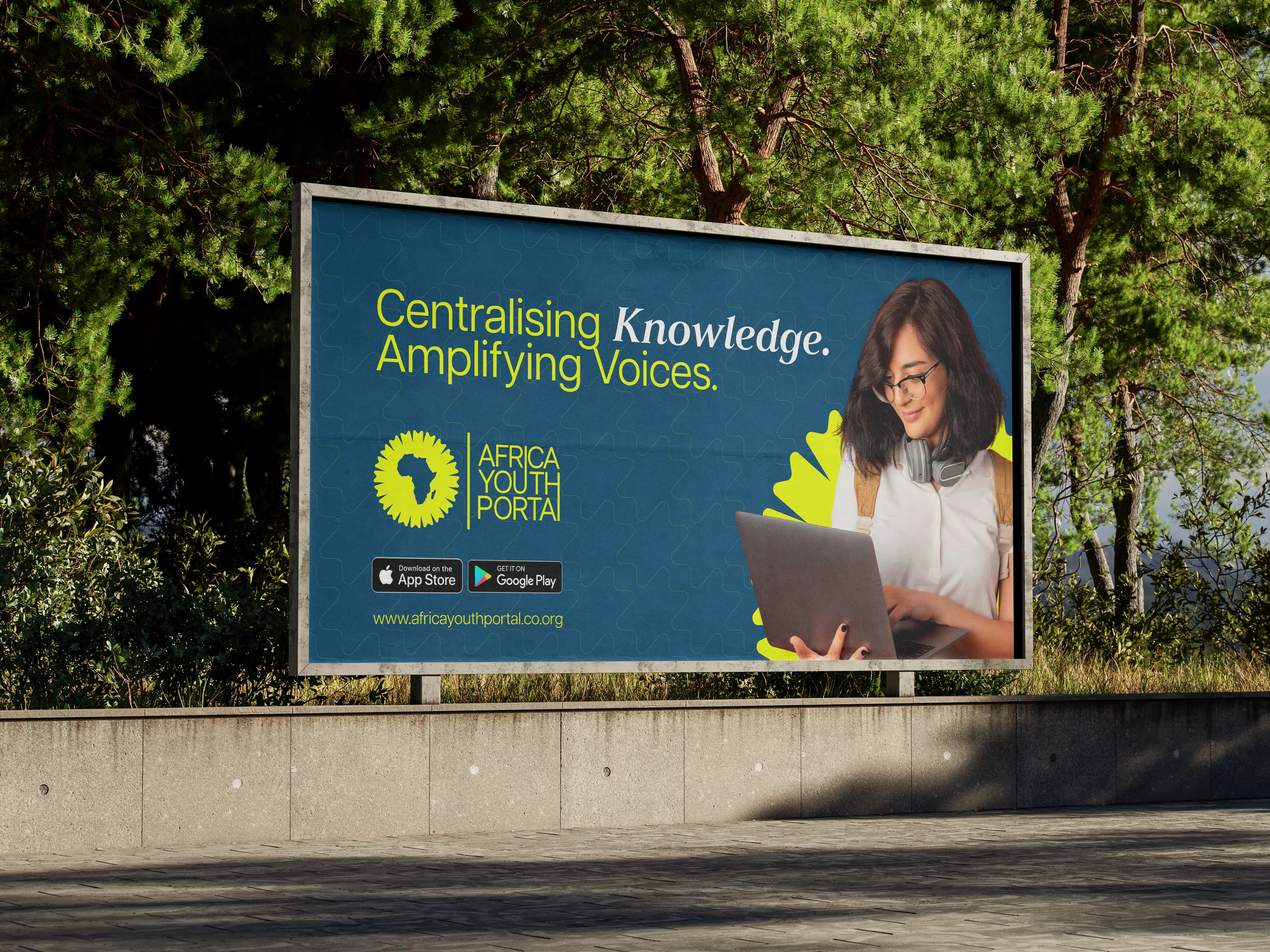
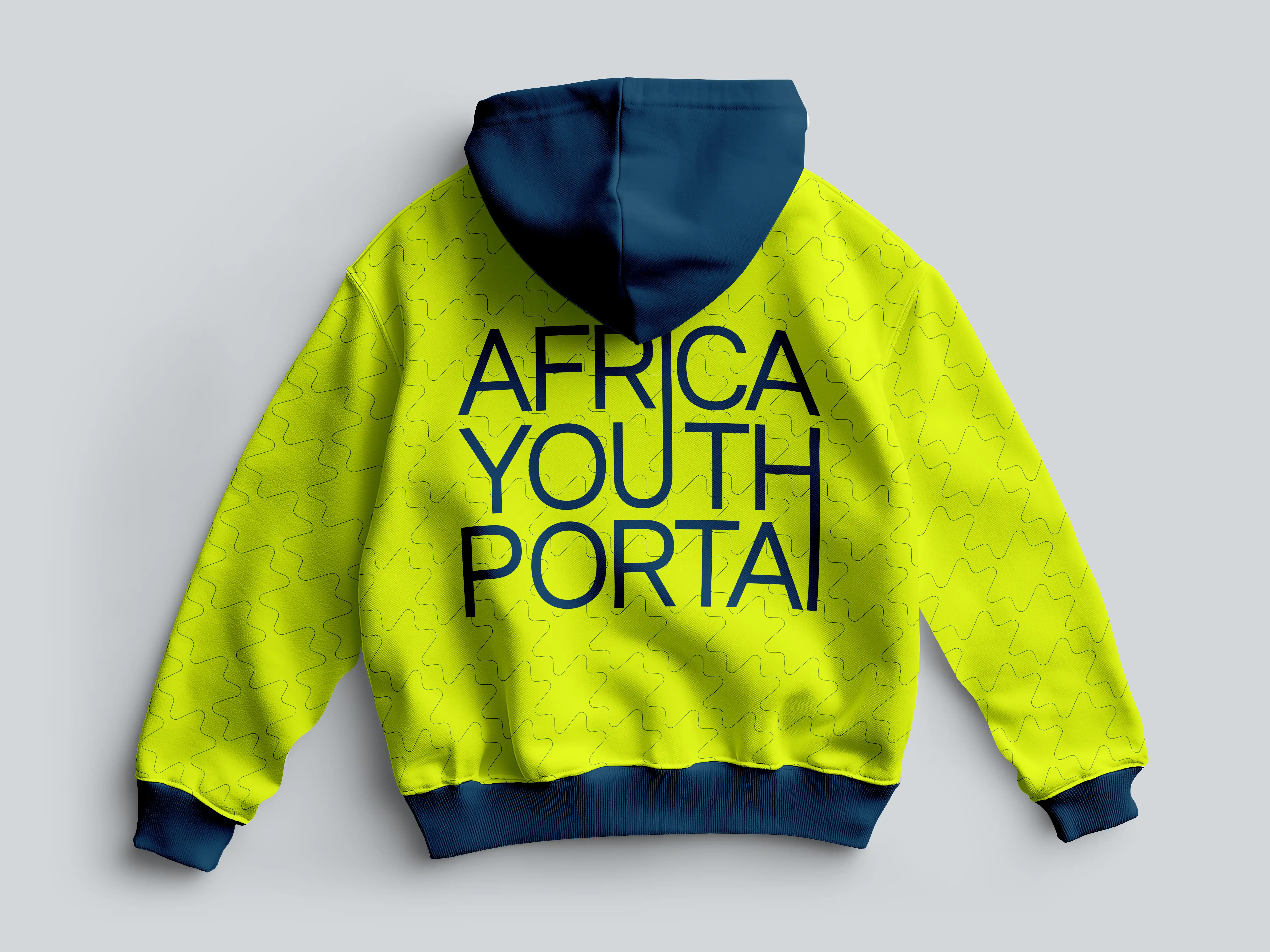
The visual language hits the "Sweet Spot" between institutional authority and activist energy. It avoids generic NGO aesthetics in favor of a clean, structured design that handles complex information with ease. Articulat CF provides a modern foundation, while Anth adds intelligent emphasis to highlights. We utilized a "digitally vibrant" palette featuring Electric Lime and Deep Teal Blue to maintain a youth-media feel.
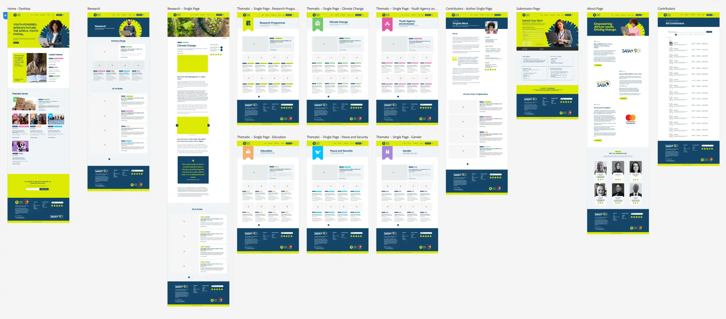
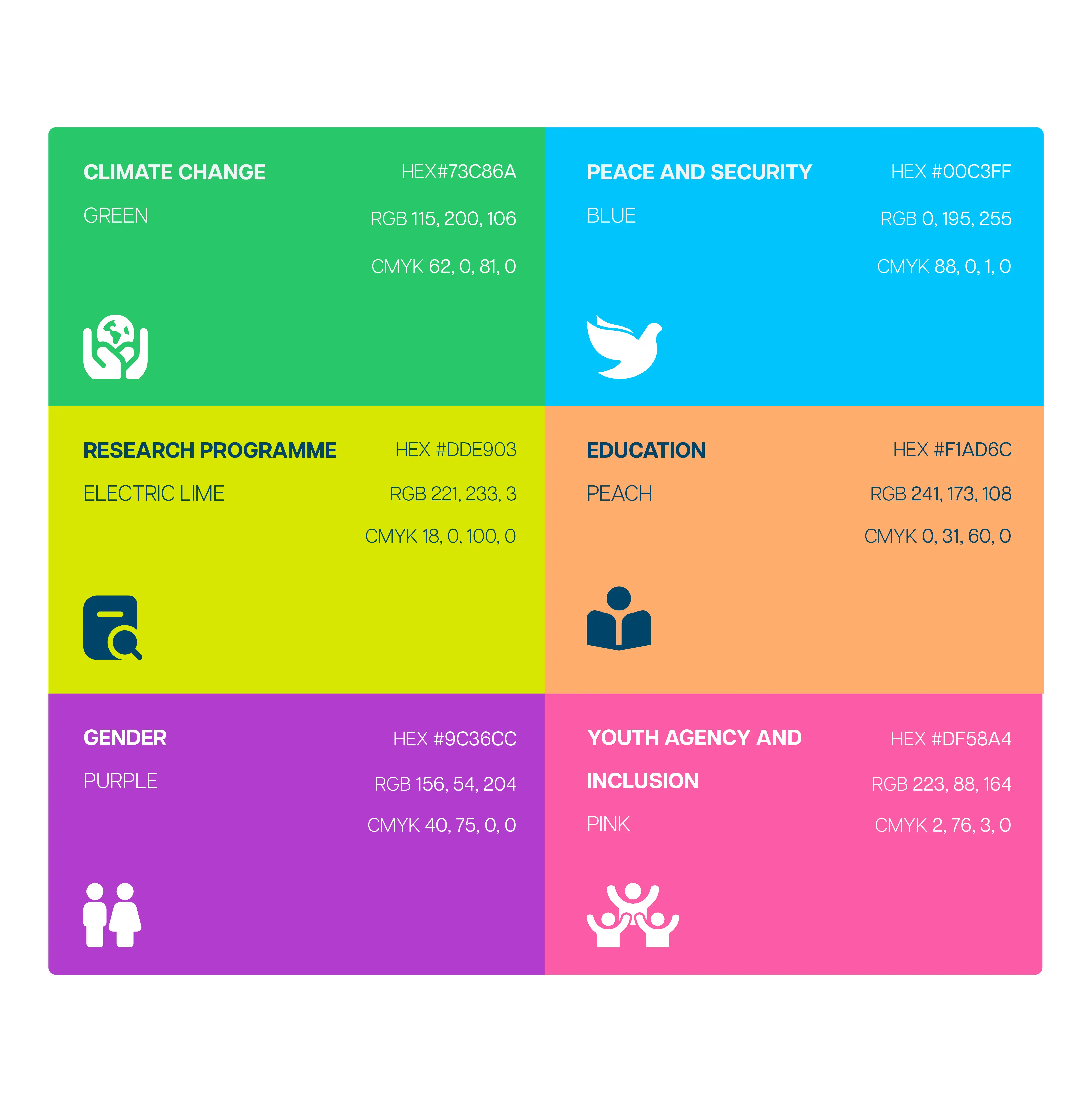
On the otherside we utilized a strategic palette to categorize five core research areas—Education, Climate Change, Gender, Peace and Security, and Youth Agency. This thematic organization allows users to navigate deep knowledge architecture intuitively, reflecting the diverse pillars of the portal’s mission while maintaining a cohesive and professional brand presence.

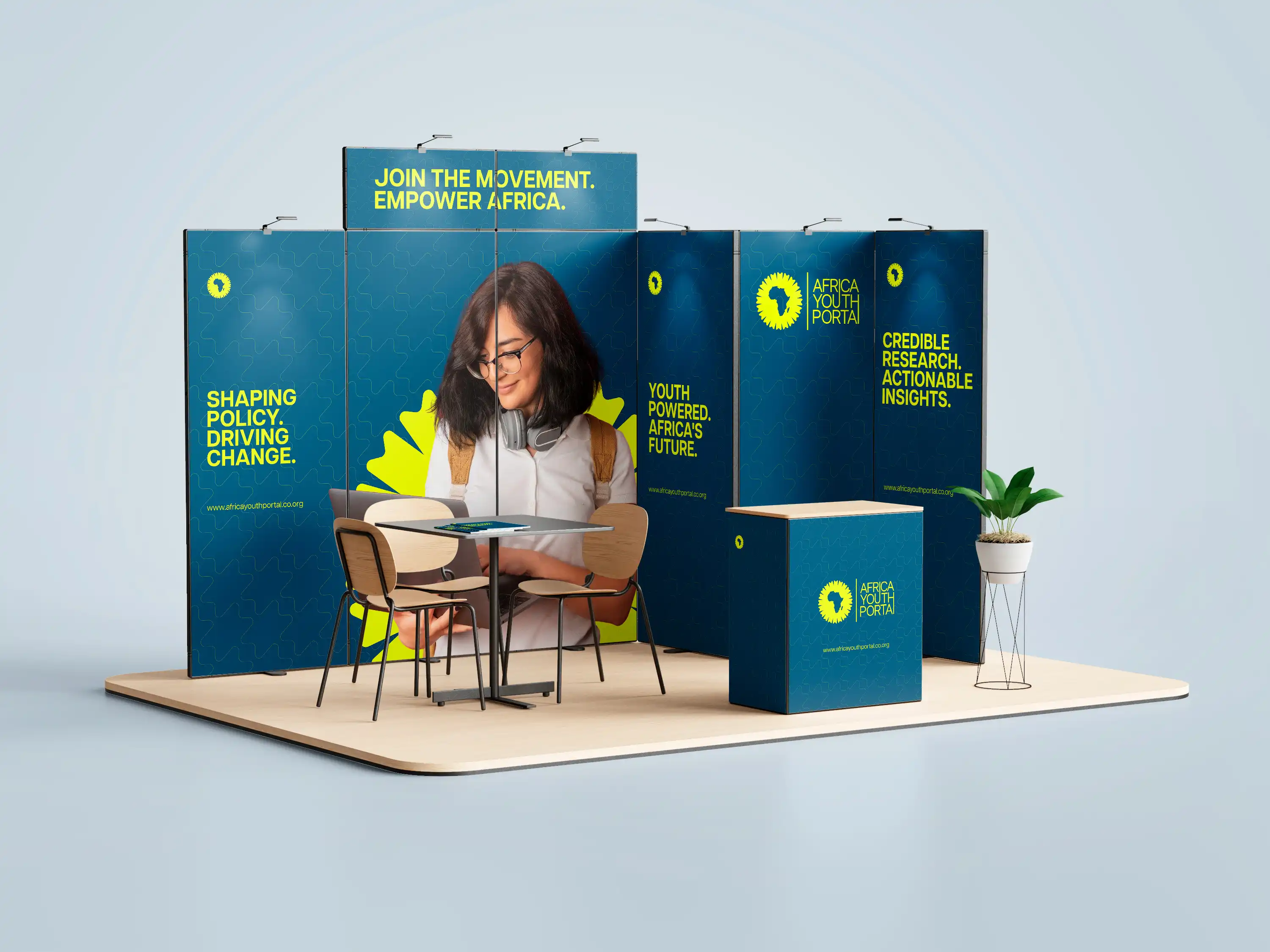
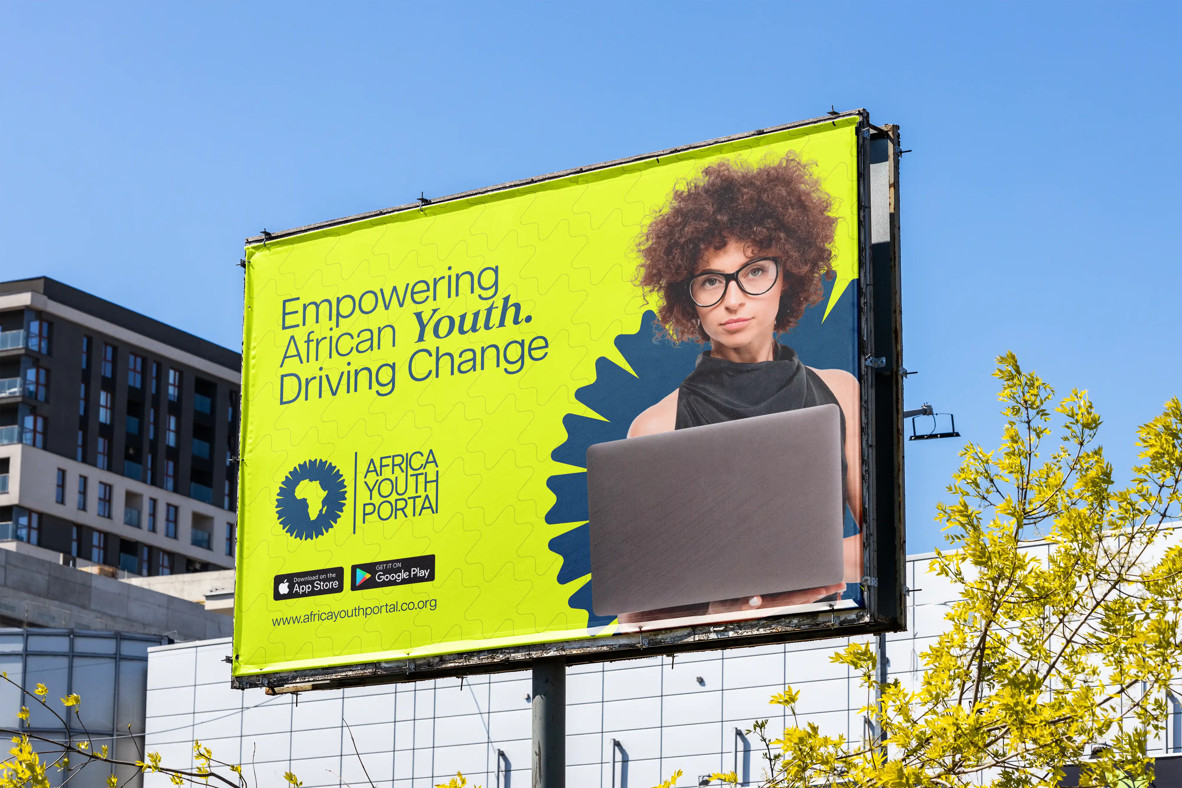
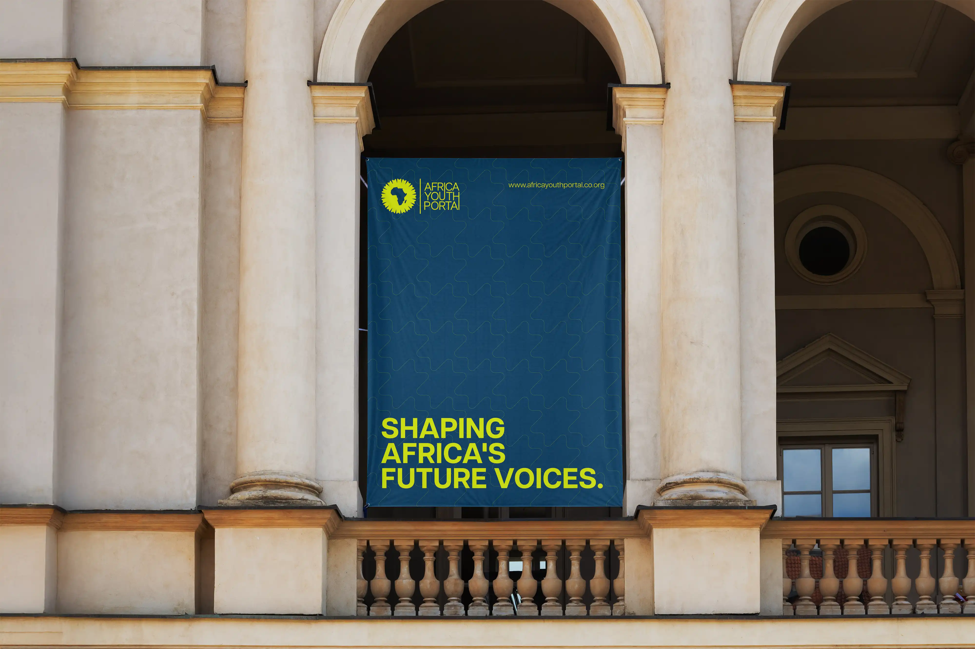
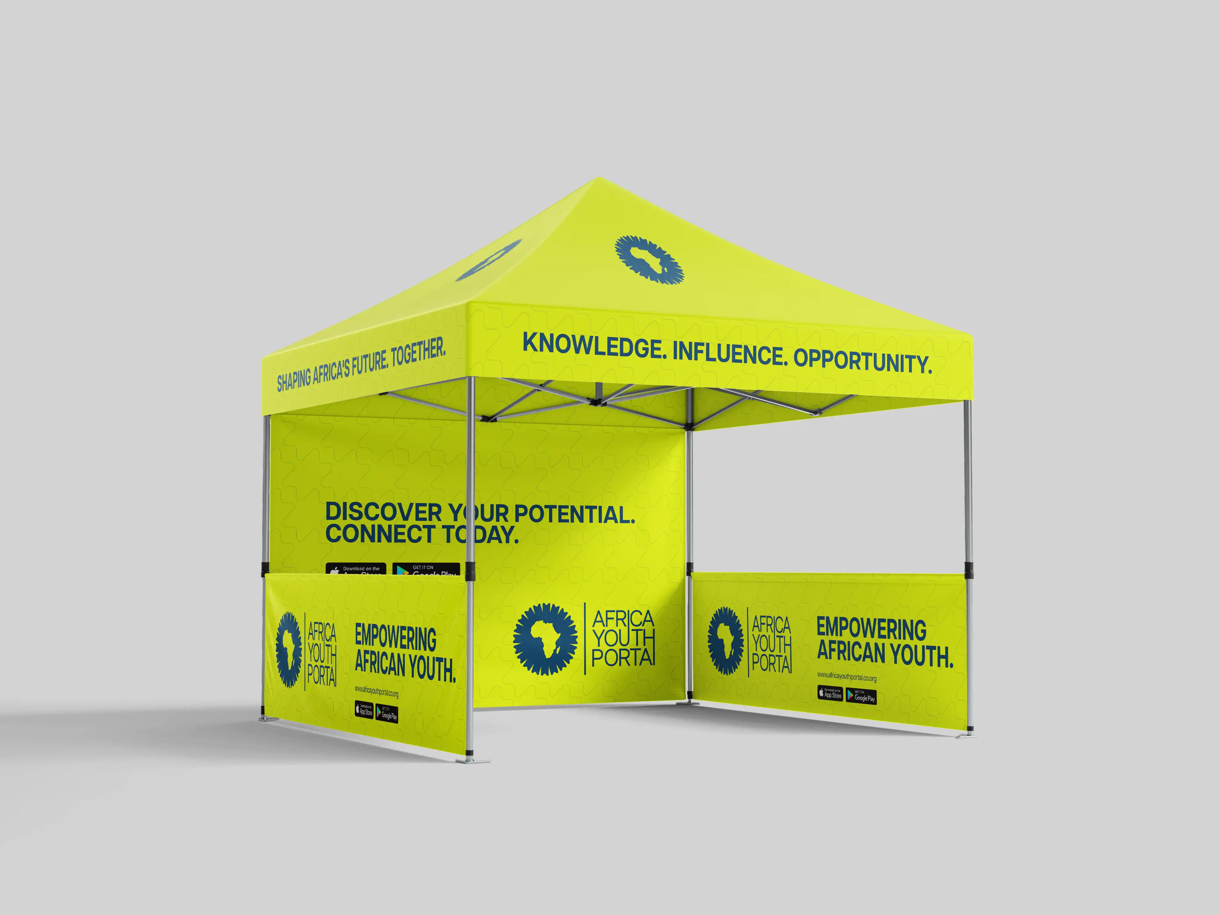
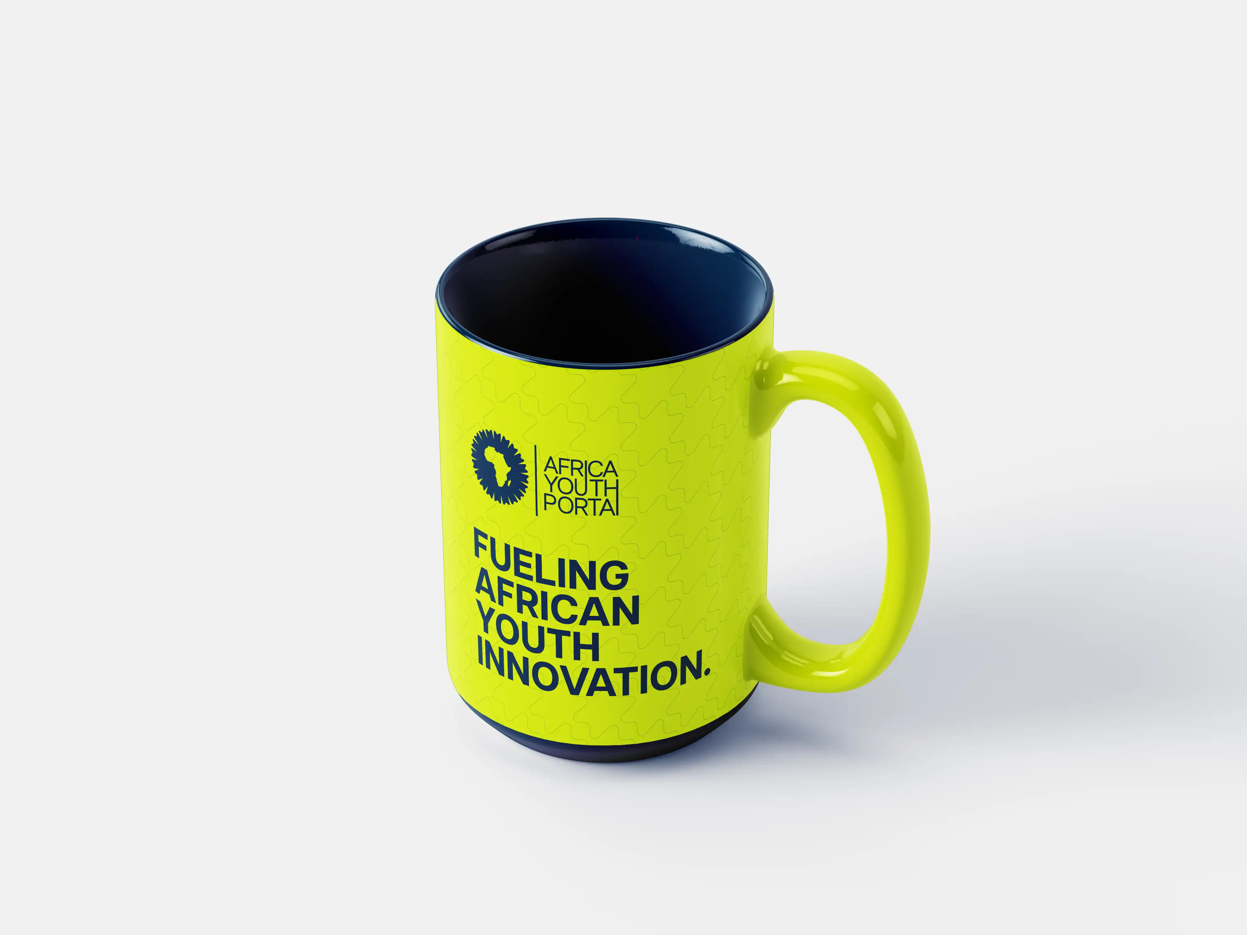
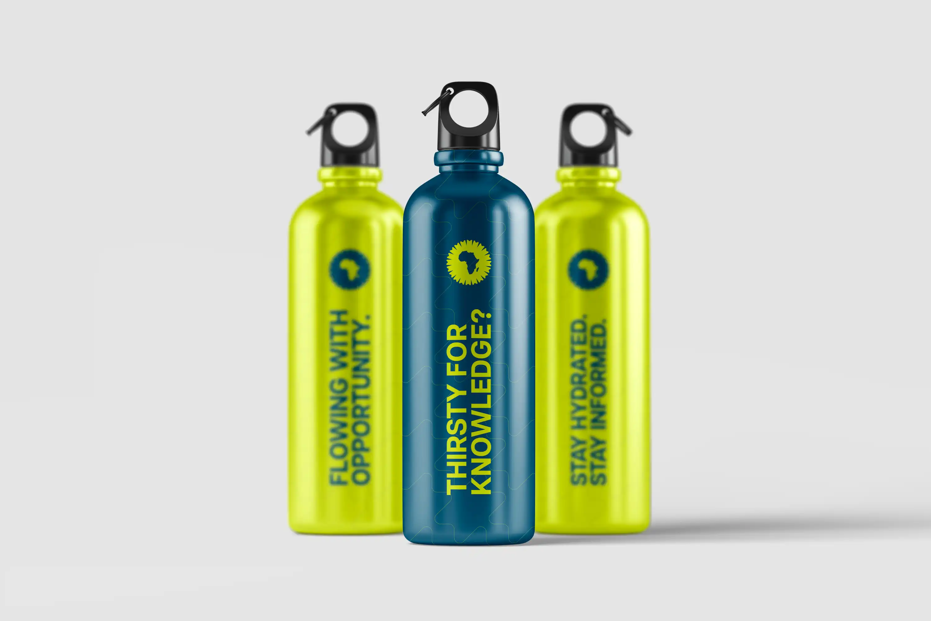
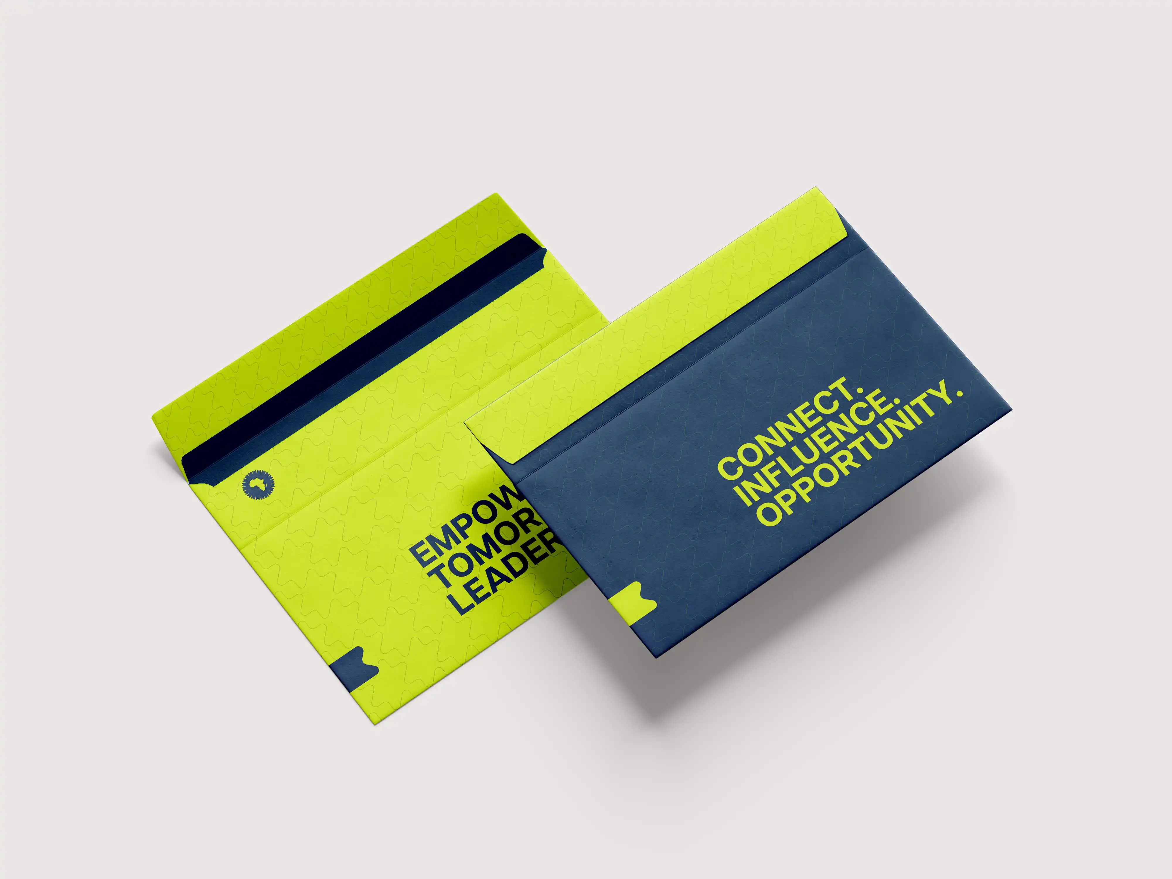
The visual language is bold, energetic, driven by a high-contrast palette of Electric Lime and Deep Teal Blue to command attention across every touchpoint. Consistent typography and modular layouts ensure clarity, scalability, and strong brand recall—from outdoor billboards to social posts. Graphic patterns subtly reinforce identity while maintaining flexibility.
The verbal identity complements this system with concise, action-driven messaging that inspires youth empowerment and progress. Short, declarative phrases are strategically applied across environments to create immediacy and impact, ensuring the brand speaks with one confident voice—clear, motivating, and future-focused—wherever it appears.


Articulat CF serves as the primary typeface, offering a modern, clean structure that feels both sincere and elite.
Anth, used exclusively in italics for headings and highlights, adds a layer of expressive elegance and visual emphasis.

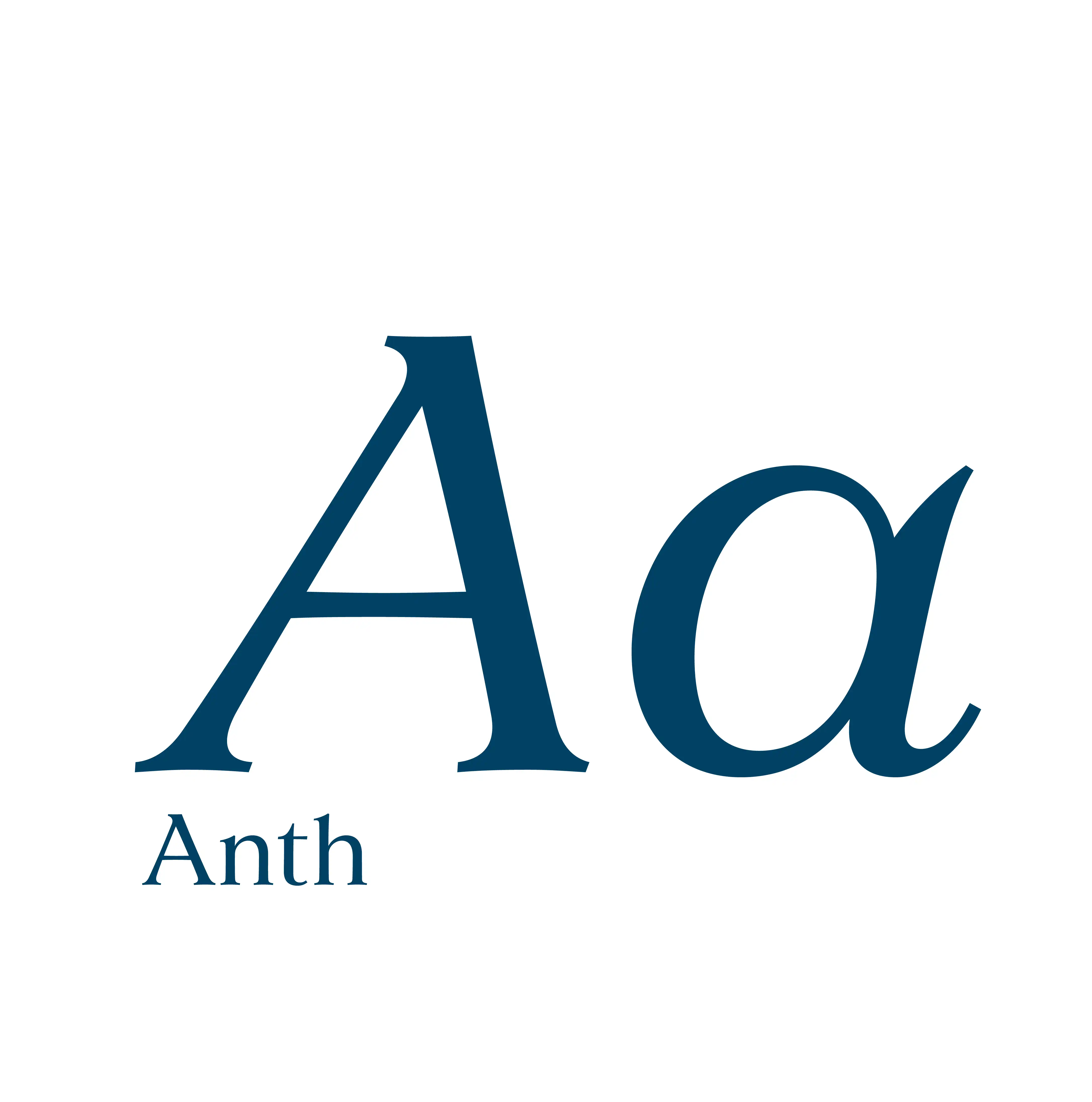
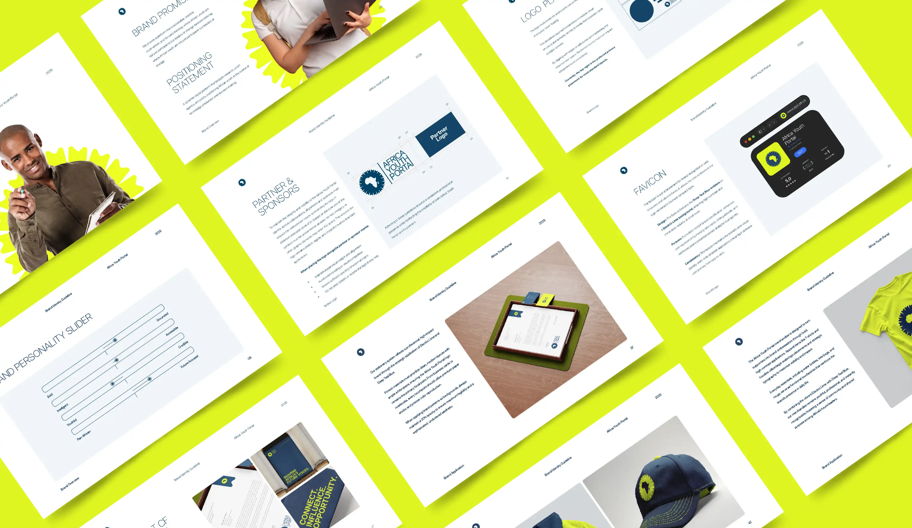
The typography system is built on clarity, hierarchy, and consistency, led by Articulat CF as the primary typeface to ensure readability across all touchpoints, supported by Anth in italic for emphasis and impactful statements. This pairing creates a balanced, modern, and highly legible visual rhythm across digital, print, and environmental applications
The verbal identity works in tandem through concise, confident, and accessible messaging—using short, action-driven phrases that translate seamlessly across platforms. From large-scale outdoor banners to social media and merchandise, the tone remains clear, youthful, and forward-looking, ensuring a unified and engaging brand voice at every interaction.


Pattern is a sophisticated visual asset derived directly from the core logo mark. By repeating and interlocking the logo's unique geometric elements, the pattern creates a dynamic, rhythmic texture that symbolizes connectivity and growth.
It serves as a secondary graphic element that reinforces the portal’s identity as a vibrant hub where ideas travel and conversations grow, bridging the gap between individual research and collective impact.


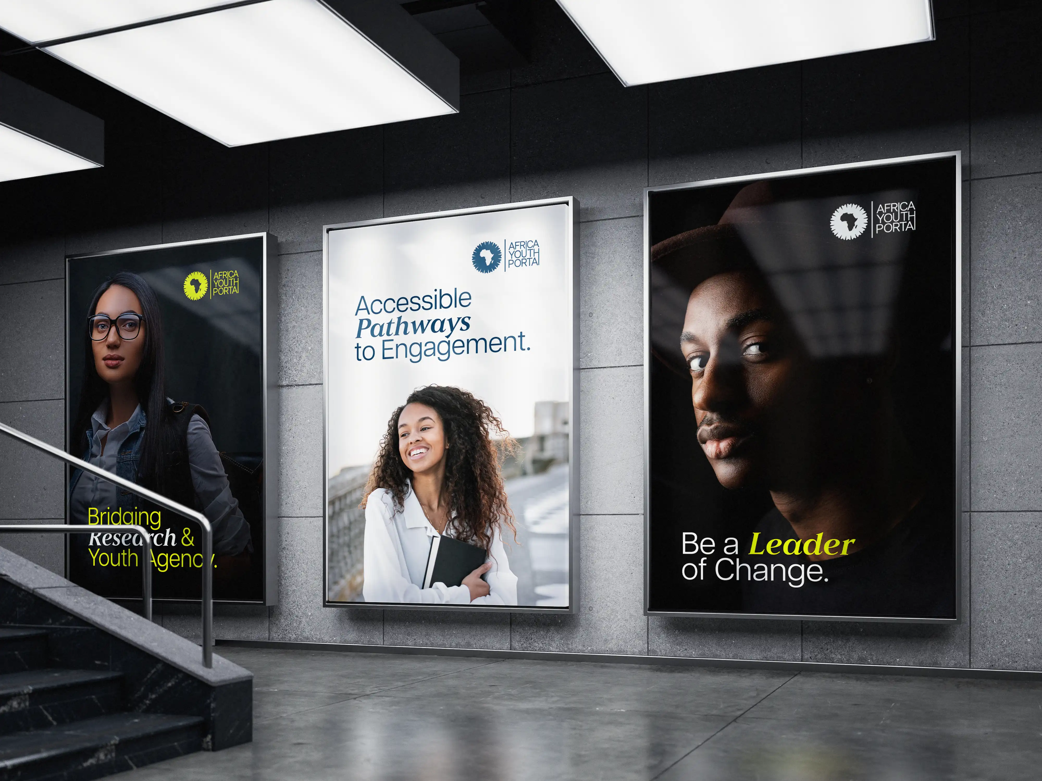
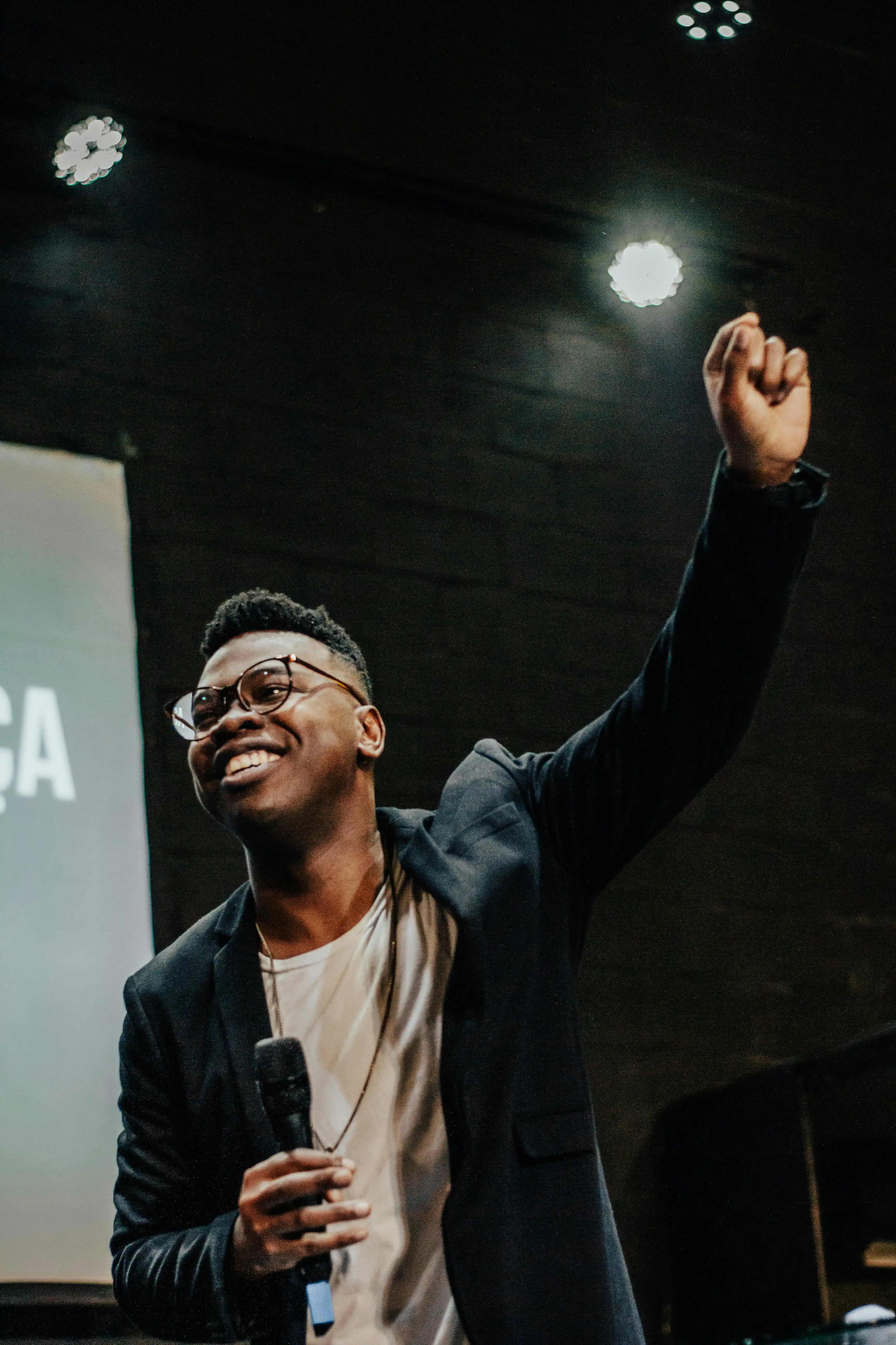
Imagery is authentic, dynamic, and forward-thinking. Visuals feature real young Africans in genuine, engaging contexts—such as collaborating, learning, or leading—to reflect brand's core values of agency and inclusion. Environmental shots are photojournalistic and camera-unaware, depicting young professionals engaging in networking and policy engagement.
By focusing on contemporary African settings and forward-facing compositions, this dual approach ensures the brand feels grounded in SAIIA’s institutional excellence while remaining vibrantly connected to the energy of Africa’s emerging generation.


The interactive design focuses on a "Scalable Digital Product" experience, prioritizing movement and connection across devices. The interface is structured to handle complex knowledge architecture, ensuring that opportunities and research are always accessible. It prioritizes a clean, modern scroll and intuitive navigation that reflects the portal’s role as a continental hub.
By integrating the thematic colors and icons system, the digital experience feels fluid, providing a seamless journey from discovery to deep policy engagement and professional networking.